Your SaaS has a whole lot to offer users. But that doesn’t mean everything when it comes to a successful marketing campaign. With people’s attention span now being shorter than that of a goldfish, the way you present your product is vital if you want to convert new users.
That’s where your landing page comes in. Having a powerful landing page determines whether someone will sign up for your SaaS, or simply decide to move on with their internet browsing. So how do you increase the effectiveness of your landing page? Read on for 8 SaaS landing page best practices to get more users.
Why do You need a Landing Page for Your SaaS?
You’ve already got a killer website, so why bother with creating a landing page for your SaaS? It turns out, there are important reasons why you’d be foolish to ignore the power of a good landing page.
It makes a good first impression
Your SaaS landing page is the first thing your potential users will see when they visit you online. This gives you the opportunity to put your best foot forward and present your SaaS as an impressive product.
It explains your SaaS in (a little) more detail
If your users have clicked on an interesting ad, your landing page is your company’s opportunity to give more information on what you have to offer. (But as you’ll see in our best practices below, it’s best to keep things minimal).
It clarifies the next steps
Without a landing page, your website visitors will be a little confused about what they should do next. Your SaaS landing page simplifies that choice by making a single suggestion: to become a user.
8 Best Practices for Your SaaS Landing Page
Without further ado, let’s look at 8 ways you can increase the effectiveness of your landing page to get more users for your SaaS.
1. Narrow down the Focus
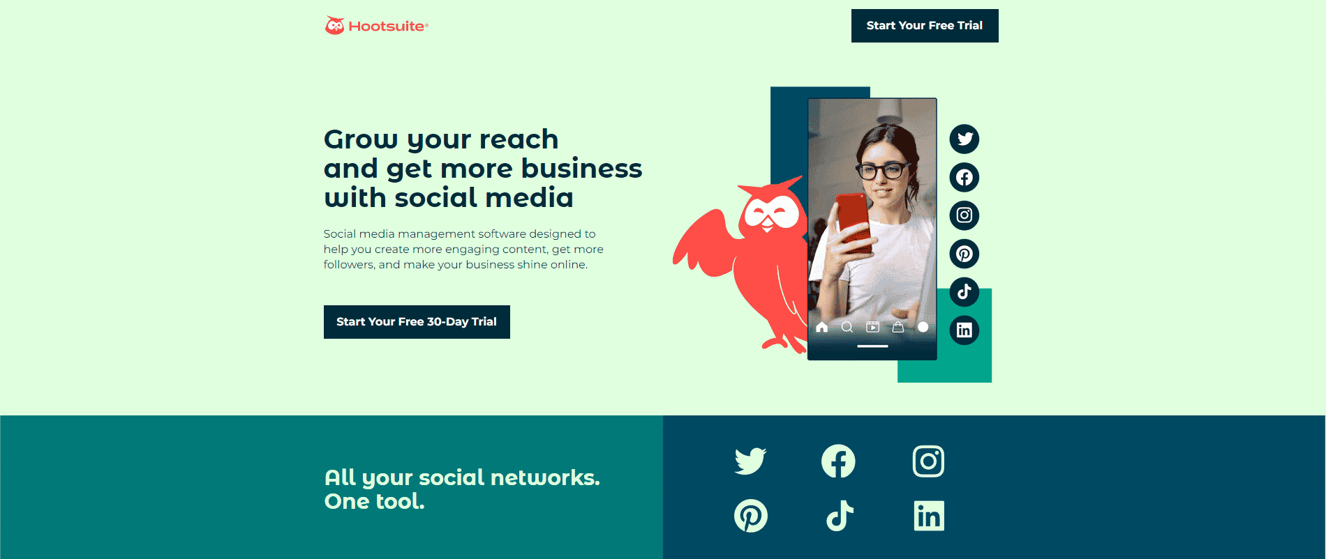
Your landing page shouldn’t have anything on it that distracts from what’s important. If you offer too many choices for your website visitor, they will get sidetracked from the message of the landing page: that they should sign up as a user.
Here are some steps you can take to eliminate unnecessary distractions:
Here’s an awesome example of these best practices in action on Hootsuite’s landing page:
2. Use an effective Headline
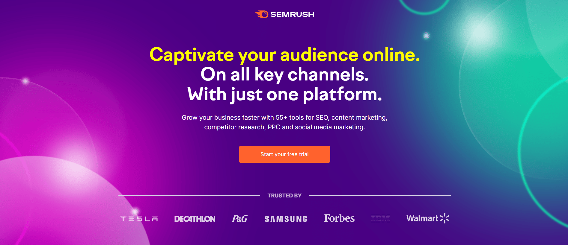
The headline of your landing page is the first thing a visitor will see, so make sure it’s a powerful one. Your headline is your opportunity to convince the visitor, normally in one short sentence, to stay on the page.
Use plain and clear language to say what your SaaS is all about. Forget about using funny or clever headlines, as that misses the whole point of the headline. You should make your headline stand out from the page using a bold, simple font. Then use it to tell people the answer to this question: what is this website about?
Take a look at the powerful use of headline copy in this landing page by SemRush:
3. Tell them how Your SaaS will Change their Game
It’s easy to fall into the trap of explaining the features of your SaaS product without talking about how it will benefit the user. Your website visitor wants to know what’s in it for them. A good SaaS landing page will make it clear how the product will change their life. This comes down to having a clear understanding of your buyer persona and their specific pain points. In other words, who are you selling to, and what problems do they have that you can fix?
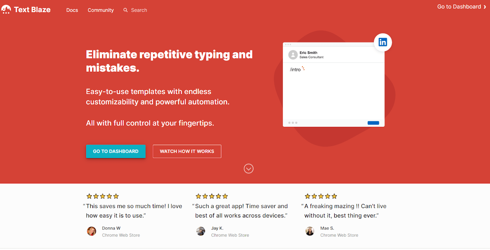
Be sure that the benefits section of your landing page doesn’t distract from the headline or CTA. One good way of doing this is to provide more detail about your product’s benefits after the fold, or main section, of your landing page.
Text Blaze’s landing page uses their main headline to immediately showcase a benefit of their product:
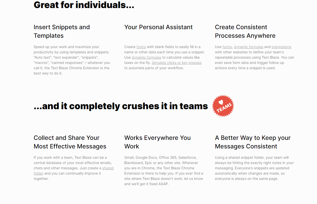
Further down the page, they provide the ways in which their product will benefit both individuals and teams:
4. Provide a Clear Call-to-Action (CTA)
The Call to Action (otherwise known as the CTA) directs your future user to take a specific action. Some examples of CTAs are “Start Your Free Trial”, “Get Started for Free”, and “Watch a Demo”.
While you might think that people don’t like being directed what to do, the exact opposite is true. Your website’s visitors will appreciate being guided toward their next step, as it makes their user experience less confusing. Use a visually striking CTA button in an obvious place on your landing page. Choose a CTA message that’s clear and to-the-point, telling them what you want them to do next.
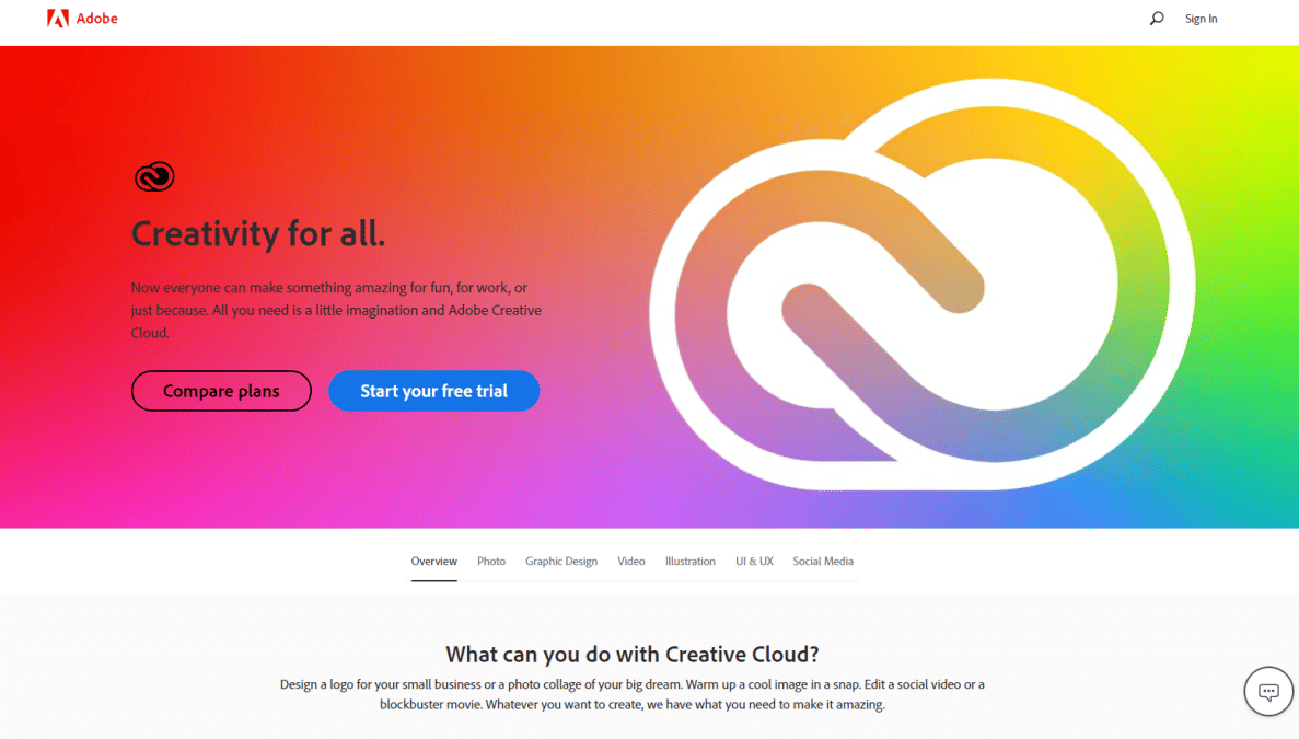
In this landing page by Adobe, there are 2 buttons that the visitor can choose from, but it’s very clear which one is the main CTA.
5. Show Social Proof
Should you include some of your product’s rave reviews on your landing page? The answer is absolutely! If you’re unsure about the power of social proof, just take a look at the statistics. 92% of people will trust a recommendation from a peer, and 88% of consumers feel as much trust for user reviews as they do for personal recommendations.
Consumers in the digital world are constantly bombarded with deals and offers, leaving them feeling a bit untrusting of any company they haven’t heard of before. Reading awesome reviews of your SaaS product could easily be the tipping point that leads to a final buying decision.
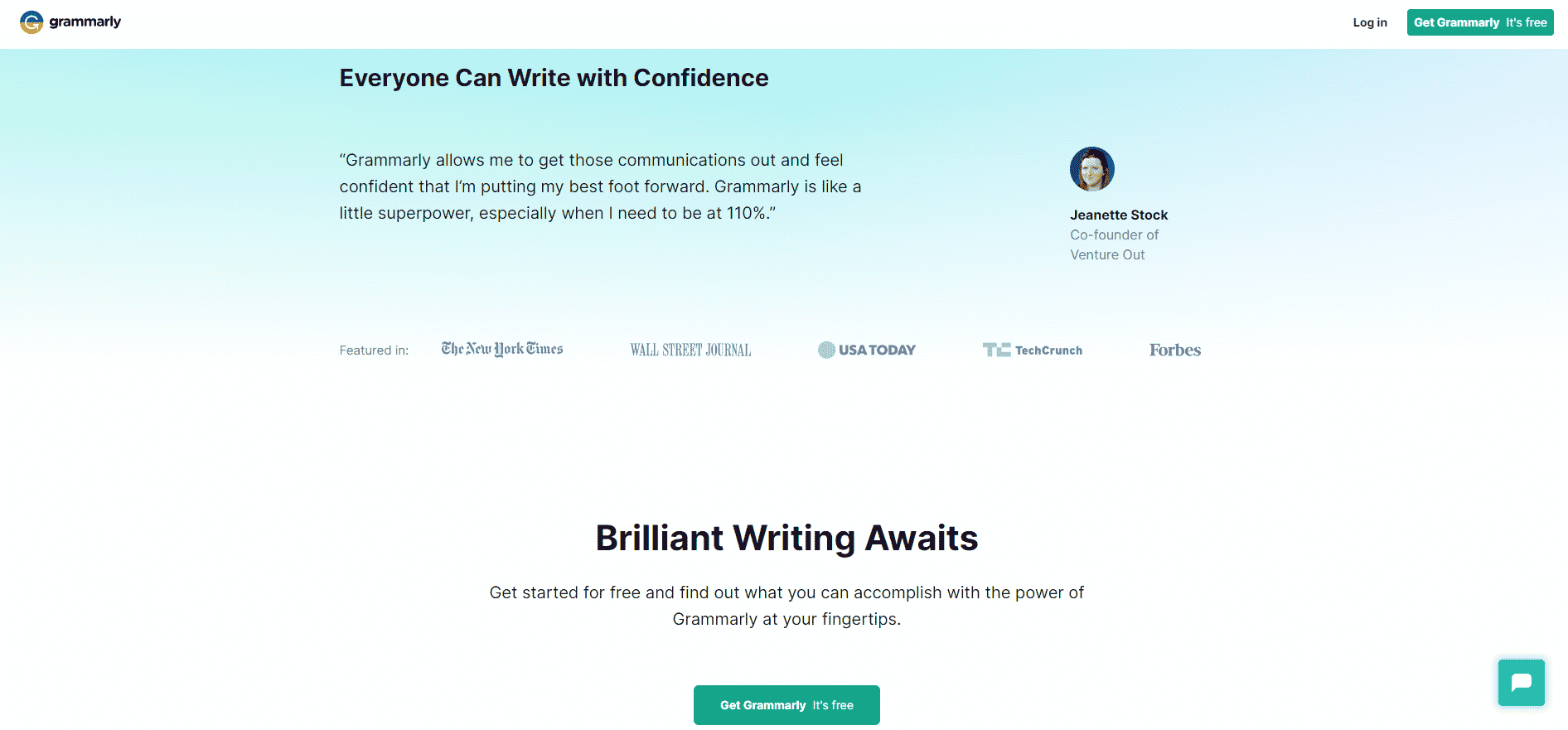
In this example by Grammarly, we can see a fabulous review from a user, as well as an impressive line of press logos – both acting as forms of social proof.
6. Offer Help with a Chatbot
A well-placed and nicely timed chat pop-up is another factor that can influence the buying decision of your landing page visitors who are on the fence. Offering help in the form of more information can make your customer feel more trust for your company. It can also eliminate any confusion about what they’re seeing on the landing page.
Most people browsing the internet nowadays are comfortable with the idea of a chatbot popping up and asking if they need help. You chatbot can answer commonly-asked questions, with the option of escalating more in-depth queries to a customer service rep.
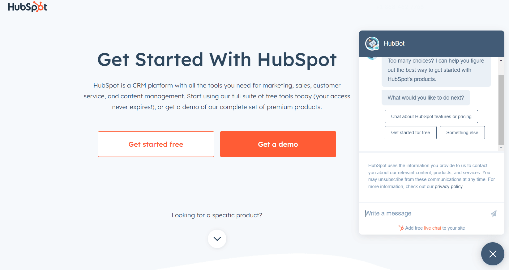
This perfect example from Hubspot’s landing page shows a chat pop-up box asking if the visitor needs any additional help.
7. Make Your Offer Irresistible
Again, your landing page’s visitors want to know what they’re getting out of providing their details. It’s vital to offer them a resource with a high perceived value. The more value your offer has to the visitor, the more comfortable they’ll feel giving you their precious contact details. This offer is referred to as a lead magnet.
An ideal lead magnet to offer people on an SaaS landing page is a free trial of your software. This benefits the user by giving them access to your software’s tools for a limited period of time – and hopefully, during that time they’ll discover they can’t do without it.
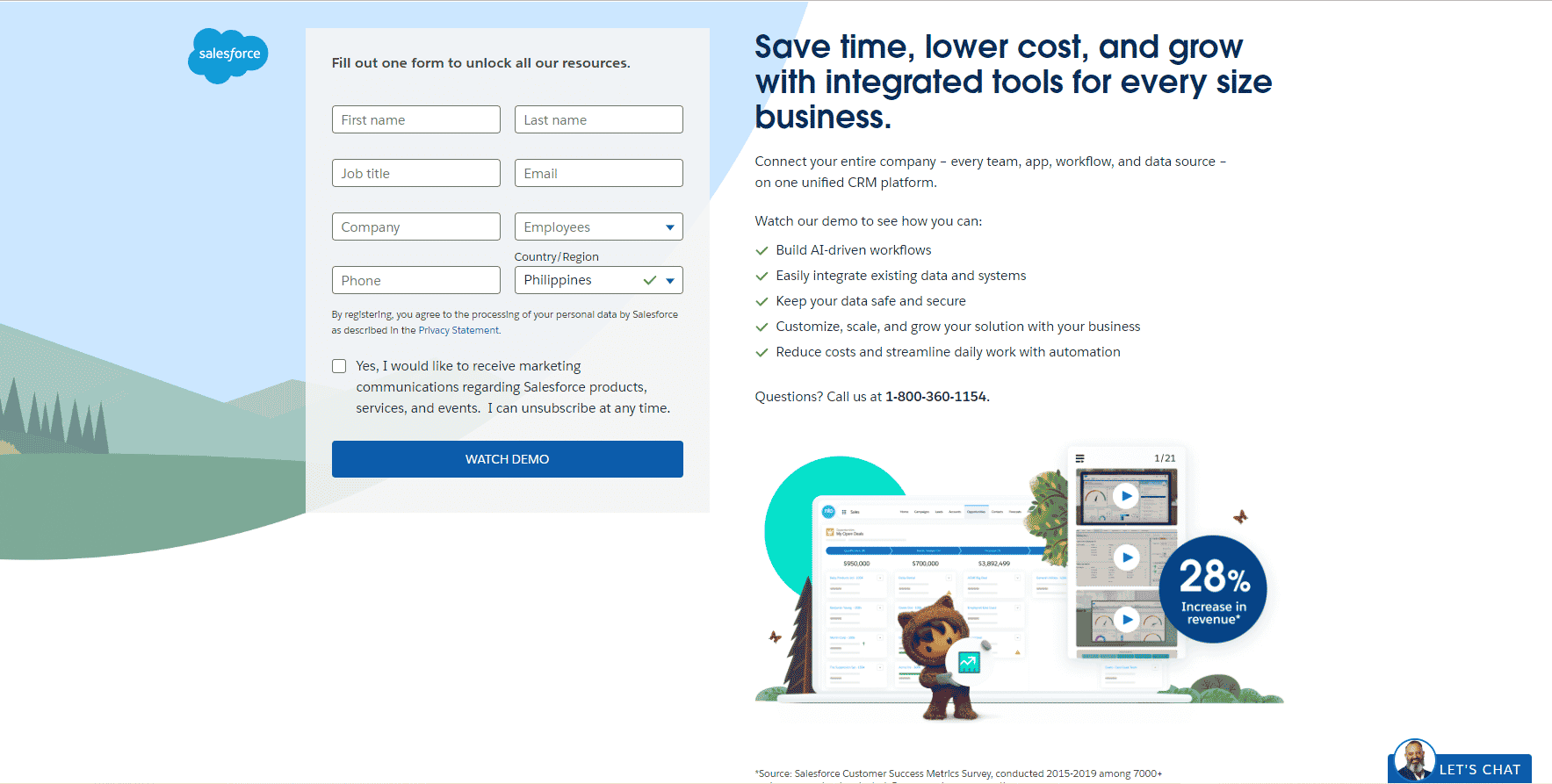
This landing page by Salesforce is a great example of an irresistible lead magnet. The CTA directs them to fill out a simple form to “unlock all our resources”, which sounds pretty exciting when you read the headline to the right.
8. Make Use of A/B Testing
What works for one company might not work at all for another. The best way to find out the most powerful landing page tactics for your SaaS company is to use A/B testing. By creating multiple versions of a landing page, you can see which one performs best.
The differences between your landing page A and B can be as tiny or as huge as you desire. Sometimes it will be testing the difference between one color or another for the CTA button, while other times you may want to test completely different wordings for your copy.
Great SaaS Landing Page = More Users
If you’ve got a powerful landing page for your SaaS, your conversions will skyrocket. By implementing these 8 best practices, you’ll be able to create a landing page that yields impressive results. (Related: 7 Expert SaaS Marketing Best Practices To Accelerate Growth)
